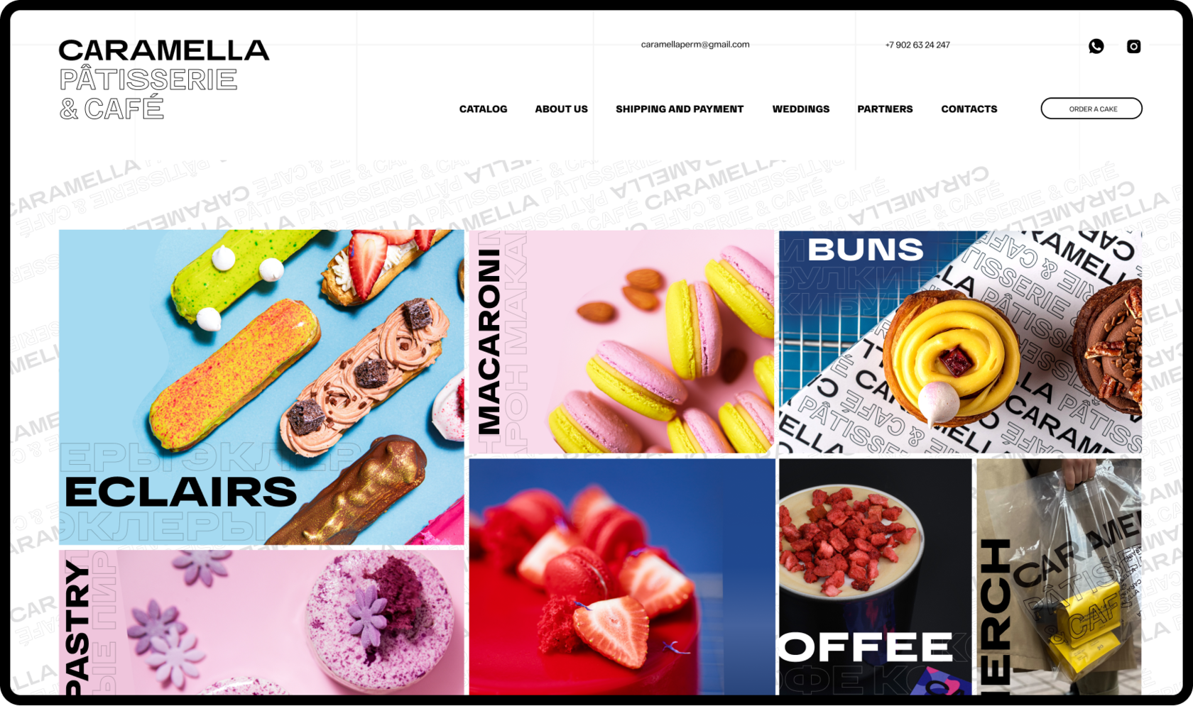
Website for the confectionery Caramella
About the project
Our task: redesign of the current confectionery website in an updated corporate style.
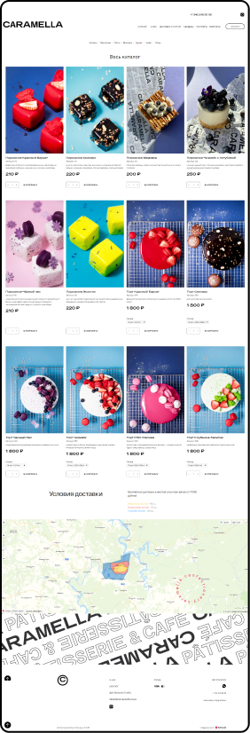
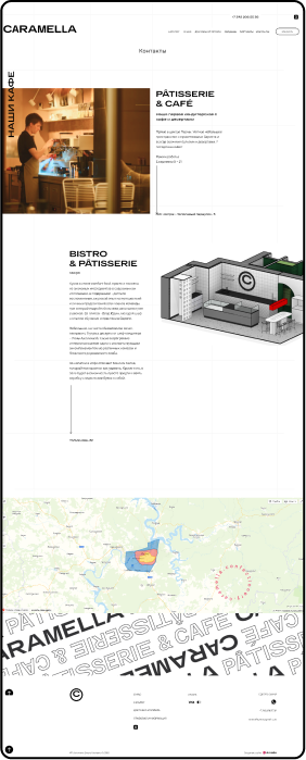
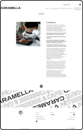
Minimalism and asymmetric card-design formed the basis of the new visual concept. We focused on a bright design and used a website builder from the Tilda Publishing.
Main page


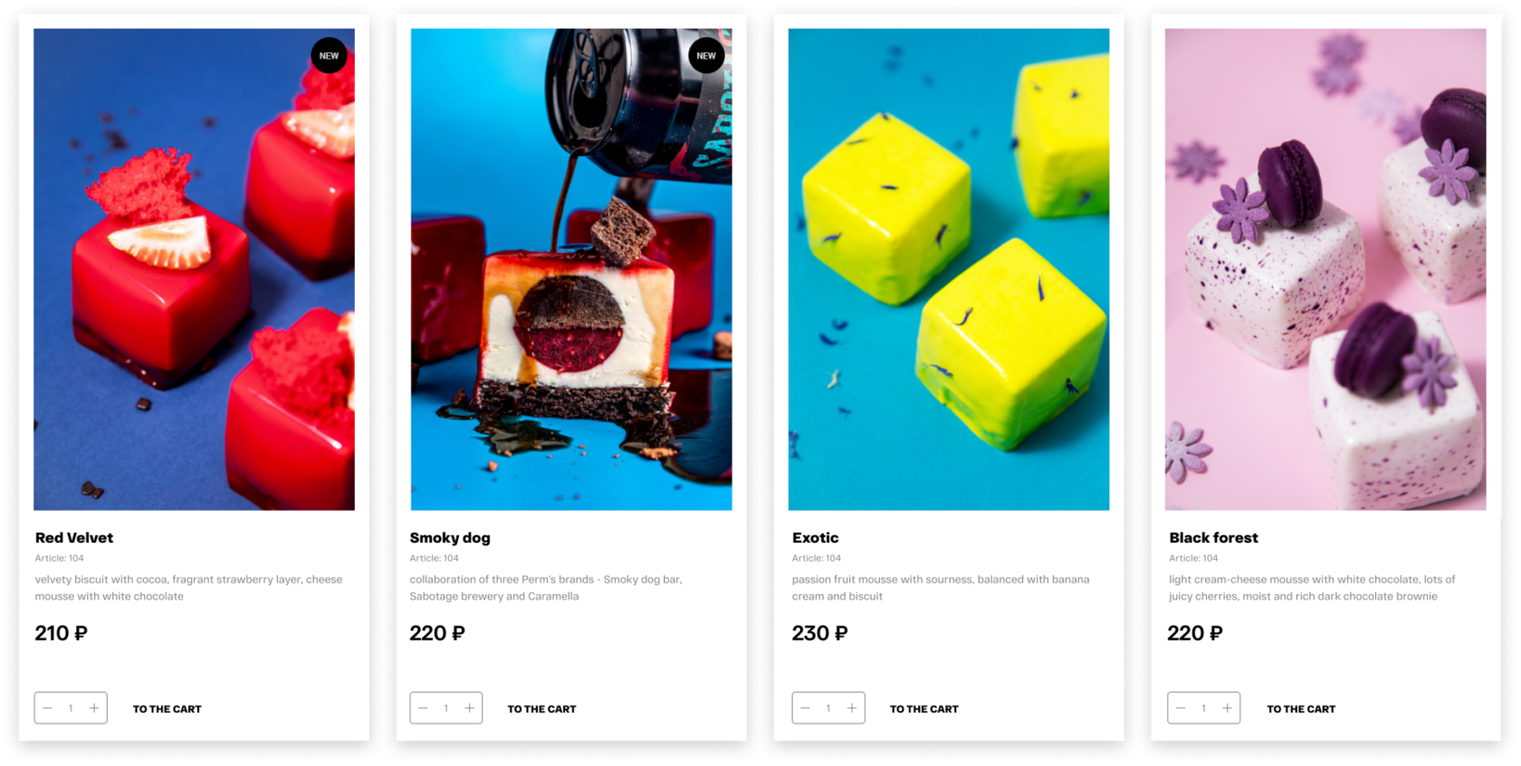
Details
Text as a design element


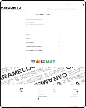
Second pages

